art log
December 13, 2024

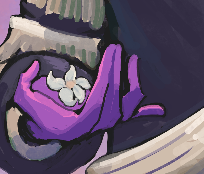
long time no post! i thought i'd never have anything substantial to say ever again about anything ever until i was working on this
not sure how much of the context matters here, but i'll start with it anyways  . art had been uncomplicated, to the point that it was almost boring. maybe i have the reasoning reversed honestly, that i wasn't working on anything with heart involved so i wasn't agonizing over everything. i want to say this is a good and bad thing, but it's mostly bad. now that i look back on it, what i made during that time felt so flat, which also explains why i wasn't posting. there wasn't worth talking about
this was coinciding with a bit of spiraling so it led to this..? the idea wasn't inspiring at all, actually (i was excited about the el dorado arc possibly being in frieren season 2), so something changed during the process and broke the nothing streak. i was starting to ask myself, "what is wrong with this?" over and over
for the longest time, i've believed that while my art is fine, there is something off about it. maybe that's being harsh... but i think it's a fair assessment, and i don't want to delude myself. it's the only way out of the perceived badness, anyhow, by leaving me unsatisfied with the bare minimum i was initially planning on leaving it
it wasn't fun. the process itself was probably not that different from other pieces, but mentally it was like i was beating my head with a stick a lot more. well....... that's just the artist's way, i suppose. there will always be some pain and you have to decide whether that pain is worth going through or not. (that is to say, i don't recommend beating yourself up, but easier said than done)
anyway, it's really funny to see the contrast between this entry and the first. i was so okay with the little mistakes and now it's the complete opposite. and it was only a month ago! perhaps this is was all a case of the winter blues, but we'll see as more entries come to pass
as for the end result itself. i? i'm not in the best place to say anything about it. 
November 23, 2024

Nothing substantial, not yet. Been busy hahahaha whatever that means. Since i haven't been spending time making stuff, i've been thinking about making stuff and thinking about stuff i've made, leading to the new art archive
Besides serving as an archive, it was mostly made because of a funny reason. I have a fucked up file naming extension in which, starting every year, i start from 1 and go from there. Maybe that isn't too crazy? But it leads to not having an obvious indication of when i started on something (i could use the Details view but i like seeing all the previews). I've also been transferring files and the dates are suspicious anyways. Had a very scary moment where something I thought i made last year was actually this year. Or maybe it *was* last year and the metadata is messed up. No one knows anymore.....
I'm definitely planning on using the good ole Year/Month/Day starting next year, but all previous years are just stuck like that. So the archive has all the files named as their dates for reference, and are even ordered by date!
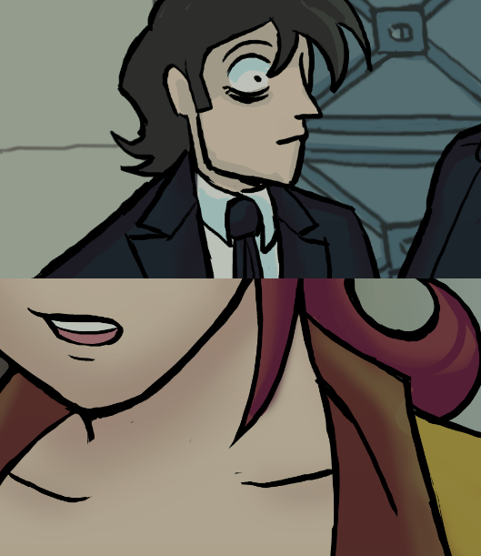
In terms of actual art: very muddy. Working on a small thing with doors. It's actually embarrassing how badly these doors are tripping me up. Consistency and all that.
November 6, 2024

(preview image lol lmao. what a load of wonk! it'll be fixed before the final upload.)
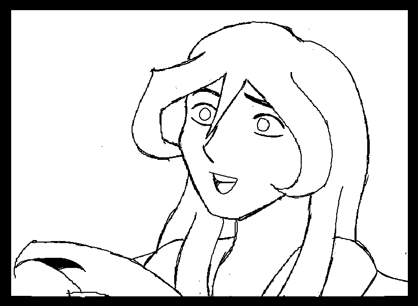
umm. what a day, huh?  that pretty much sums up how i felt throughout this entire process. as in, i had no idea what i was doing or what was going on
veryy much the complete opposite of the previous piece, which helps in seeing the why. most of it has to do with the fact that i was going completely off of my imagination, instead of working with an already existing thing. i also wanted to be "neat" and that meant using layers, more than i've gotten used to (the bliss of only using 1-3 layers...)
i used to be really neat with my art (you can see this with the art i have on the site), mostly because i was afraid of something not turning out right. and now that i'm completely out of practice, it shows. it's incredibly embarrassing how wonky the lines look. i think it's because i'm not used to working with pen pressure  . maybe i should have turned on the stabilizer..?
as for the imagination part: lol. the problem with working without constraints is that you have a lot of options. admittedly this is a non-problem because even with a lot of ideas, you'll know which one you like the best. i guess my specific issue here is that i feel like i could have done something better? probably. but that's OK, there will always be more opportunities to improve on this specific idea later
and OH YEAH, how could i forget. BACKGROUNDS. i'm already uncomfortable with them and with the whole layers thing? not very fun. how do people do this??? that being said, i don't hate it, which is honestly a big win in my books!
so, overall, a strange process where things a lot differently than how i'm used to. if nothing, it's a step towards being able to make more cinematic art. 👍
November 3, 2024

(preview image. full will be posted in a fewwwwww)
it's been so long since i've been this excited for a piece!! very much based on and inspired by Casino Royale's opening, "You Know My Name". thank you james bond movie intros for existing
a weird amount of coincidence led me here. out of the blue, i assigned card suits to the characters shown here, just for fun... a few days later, the song got recommended to me. a fucking banger of a song, so of course i put it on repeat. and then i watch the video and ohhh wow
it just all came together, really. a little too perfectly?
working on it was a nice mix of everything i've learned before (lineless silouhettes) and something new (working with patterns).
the patterns are, uhmm, not pixel perfect because i laid them out myself and manually adjusted it if it wasn't looking right. it doesn't look shabby though, so i can make peace with it 
in general with my art i've noticed that i've been a lot more relaxed, with both ideating and executing. i probably wouldn't have even considered making something like this if it wasn't for doing something like the dailies, where i worked with the lasso tool a lot
(i've come to love the lasso tool in the past few months. it just makes everything so much easier, man)
i've also learned to be more okay with the ugly stage of art. i nearly considered omitting the second third because it wasn't looking right. instead, i ended up moving on to the next part and when i came back to it, it was just... smoother
yaup, a whole lotta fun came with this, it was great! 