how to make a website you like part 2
the first ever blag post was a list of three (3) websites that i thought did something really well. it's been 5 months since then, and i have surfed the web and found more websites that are similarly inspirational
i've also been thinking about sorting websites on a sense-nonsense scale, or put in another way, informational-entertainment. the internet has a need for both, neither is greater than the other. we love our wikipedias, but we also love our crouton.nets
i'm still noodling on that idea, but in the meantime, here's a list of six (6! yep we've doubled it) c00l websites that placed upon across that scale
nonsense
radiohead's kid a
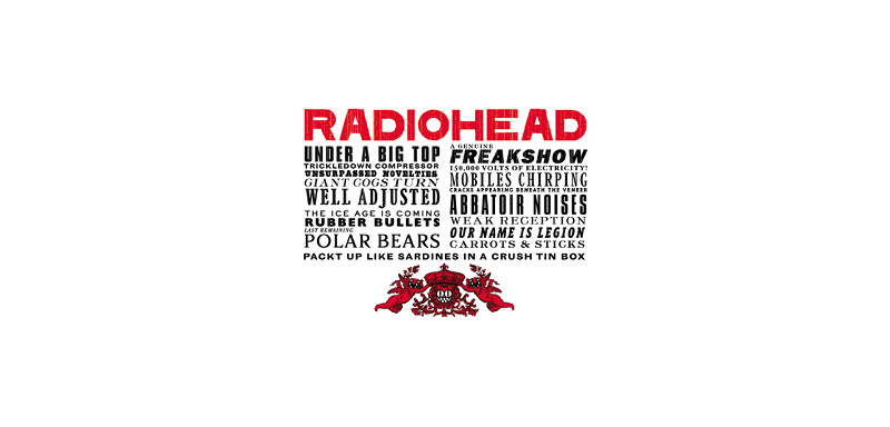
this website was bound to end up here, one way or another. maybe it helps that it's radiohead, but it's my favorite "nonsense" website for sure. stanley donwood, radiohead's artist, has always had great synergy with the band and this is just one example of that. if you look inside you'll find his art and some poetry (i think?) which is likely just a mishmash of thom yorke's thoughts and lyrics
maybe what also makes this so good is that it's history. with "kid a" being released in the 2000s, you can see that the website is an exploration of what a site could do or be. it was also kid a that popularized digital-first releases and when yorke started making lyrics by randomizing phrases because he was tired of his lyrics being so personal. the website is evidence of both things, of a band's innovation and of an artist's shift in style
it would be wrong of me to leave this off without including the main radiohead website, which acts as a museum for everything they've done so that's also something to check out
cannibalcat

warning for gore & potentially disturbing content
the internet is a scary place. here's how you can make it scarier
fascinating site, beautiful art. the tip to click things that don't appear clickable is super appreciated for sites like these
sense
jodieblend's minecraft house
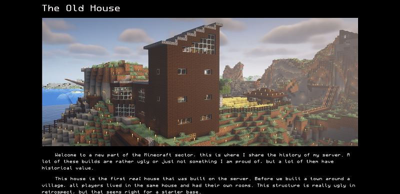
this is the first page i've ever seen a (autoplay, no audio, looping) video, which basically acts like a gif. if you've ever tried to use gifs on your website before, it's likely that you ran into an issue of them loading too slow, even after compressing them. for some reason, videos load faster even though you'd expect them not to (i mean, i did, at least). So.... Now You Know!
(regarding the page - i love the cinematic screenshot of the "ugly house".. it makes it beautiful in a way. the minimal style is also really nice)
soweli
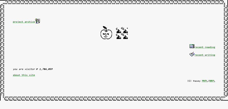
you could probably say that this leans more towards "nonsense" but this is sense.....to me
the webmaster's motto describes it perfectly, "Click around and find out!". this is an incredibly jolly website. even the licensing is jolly. i'll admit that i like this site a lot because it feels similar to mine, especially the project archive which has a lot to play with
i haven't finished going through all of the projects or even the ones i'm about to link, but i like how they feel: GAFFE: a clown goes through hell (a whole story!), the mandelbulb, lessmore
too much sense (professional)
masa's portfolio
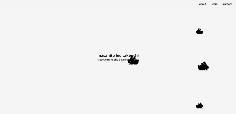
while the web is full of professional sites that are bland, this and the site below stand out because of their fun takes on "professional web design"
what's cool about masa's portfolio is his work. it includes some interactive projects featuring adorable pixel art that you can play with. have fun with these: interactive ducks and small world
activetheory's prometheus
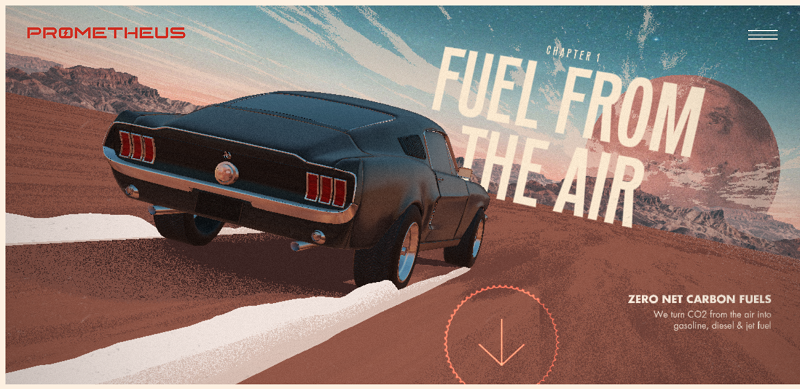
for prometheus, activetheory created a website that tells their company vision and story as you scroll through the animated home page. it's like a flip book: you can control if the animation is going forwards and backwards, and how fast it plays. there's even interactive elements
but mostly what i wanted to show is their case studies. if you've ever wondered how a company would go about designing a "fun but professional" website (though sites aren't the only thing they make), their case studies are available to read, which includes gathering inspiration and building out the user experience. to me, it's a rather unorthodox way of making a site (for prometheus they had to create storyboards!) so i enjoy that they've made their process public
for a case study on another website, here's one on their adidas project